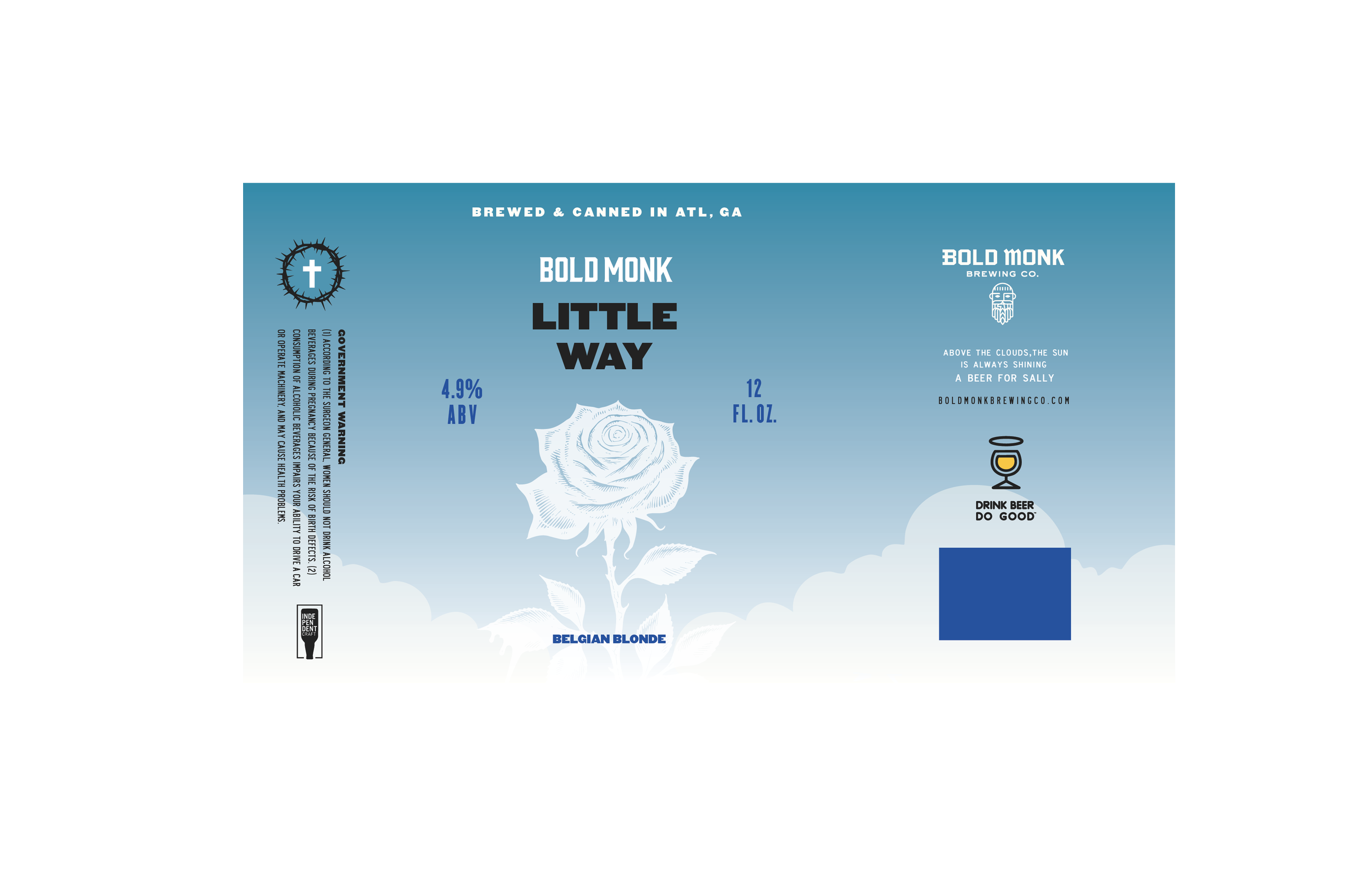
BOLD MONK BREWING
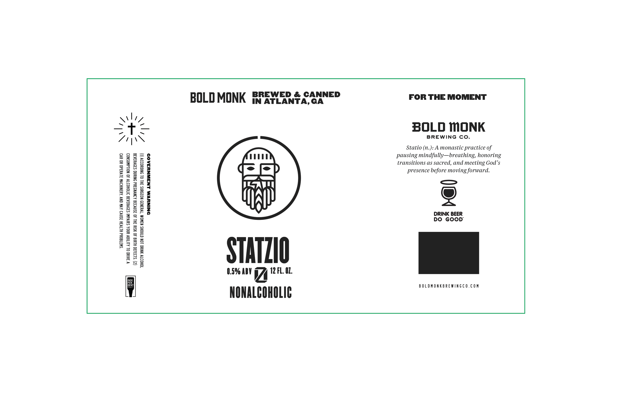
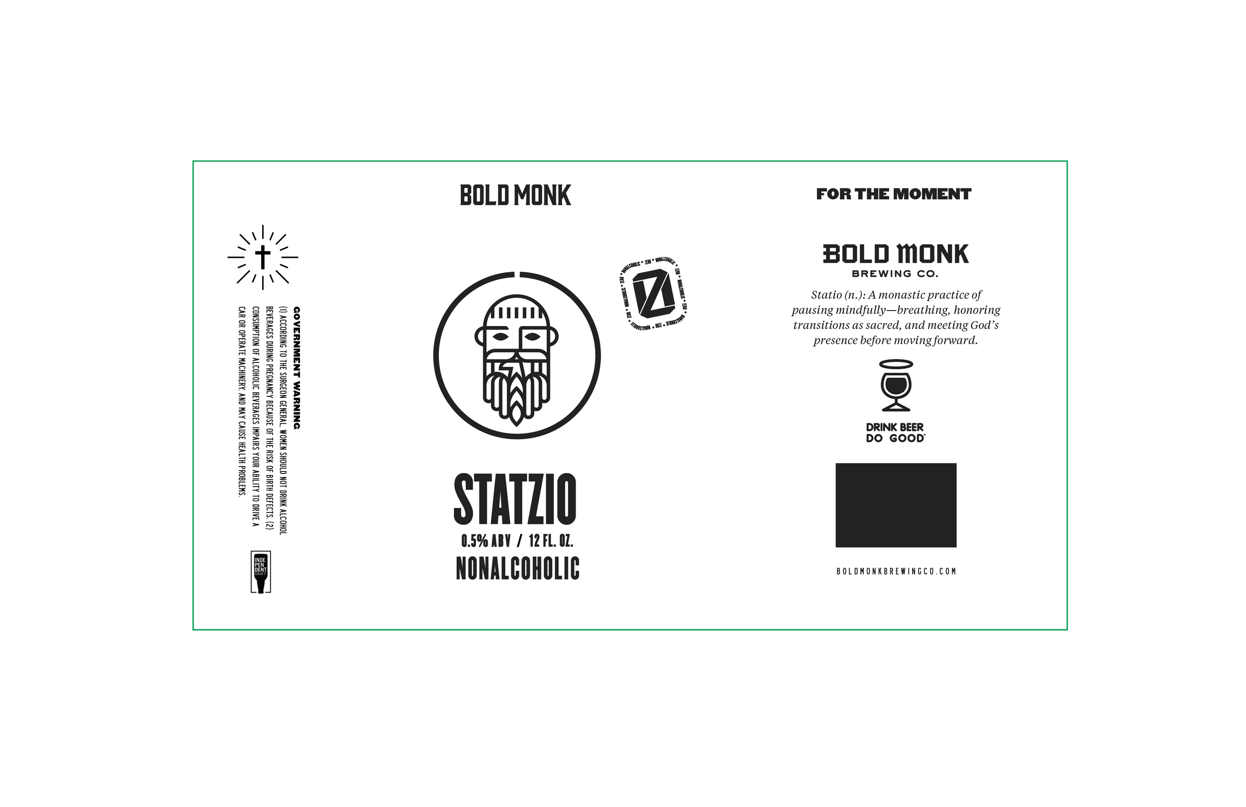
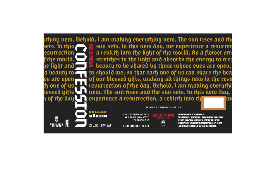
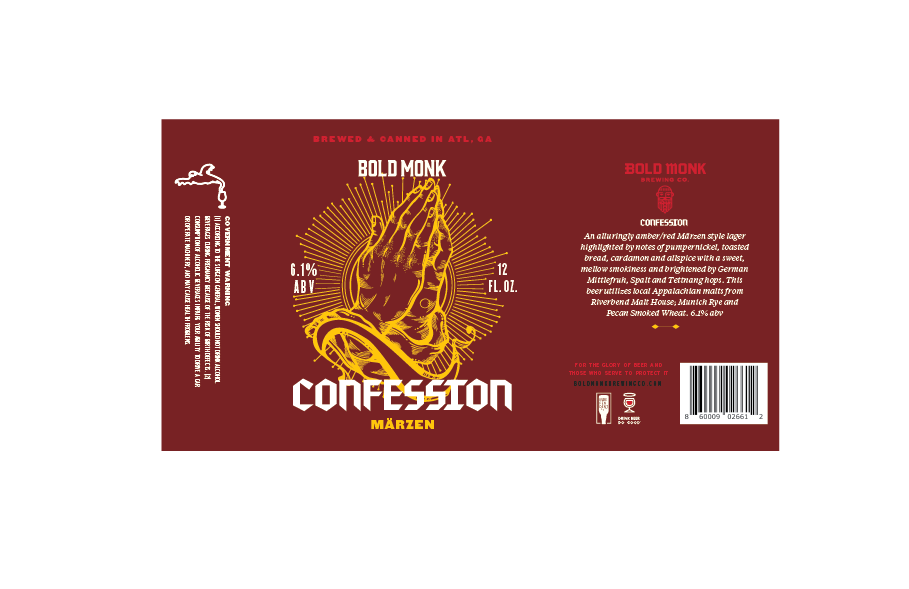
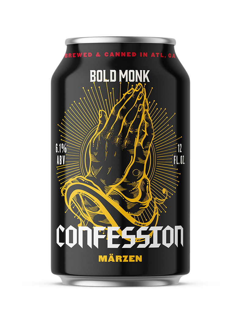
Client-commissioned packaging concepts for Bold Monk Brewing, an Atlanta brewpub rooted in the monastic origins of Belgian brewing. The brief: carry the brewery's identity onto a canned series. The system translates illuminated detailing, ecclesiastical type, and devotional iconography into cans that feel reverent yet modern. The brewery ultimately moved in a different direction, and the work is presented here as concept development.
BRANDING | GRAPHIC | DIRECTION | PHOTO EDITING
Ideation
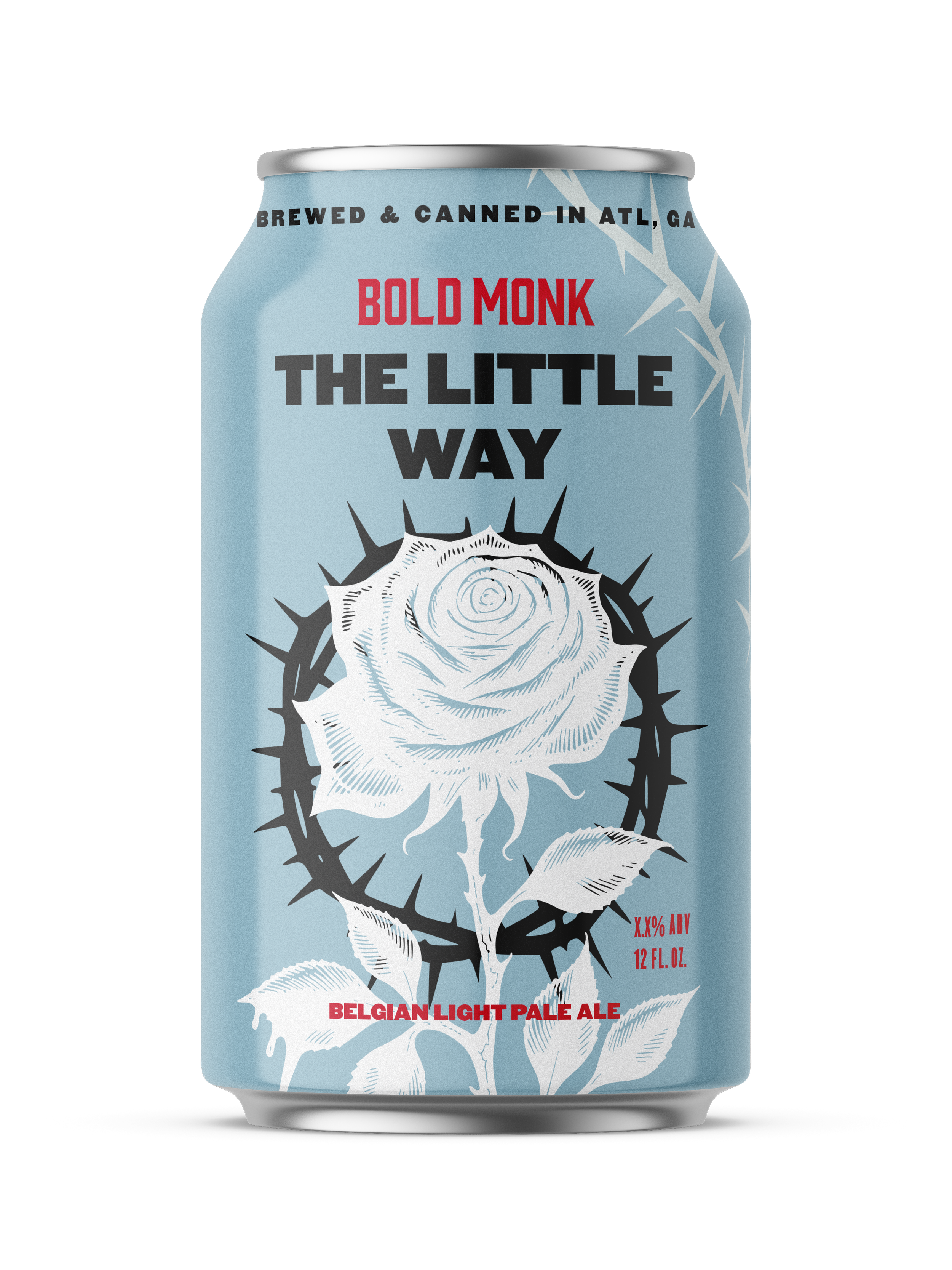
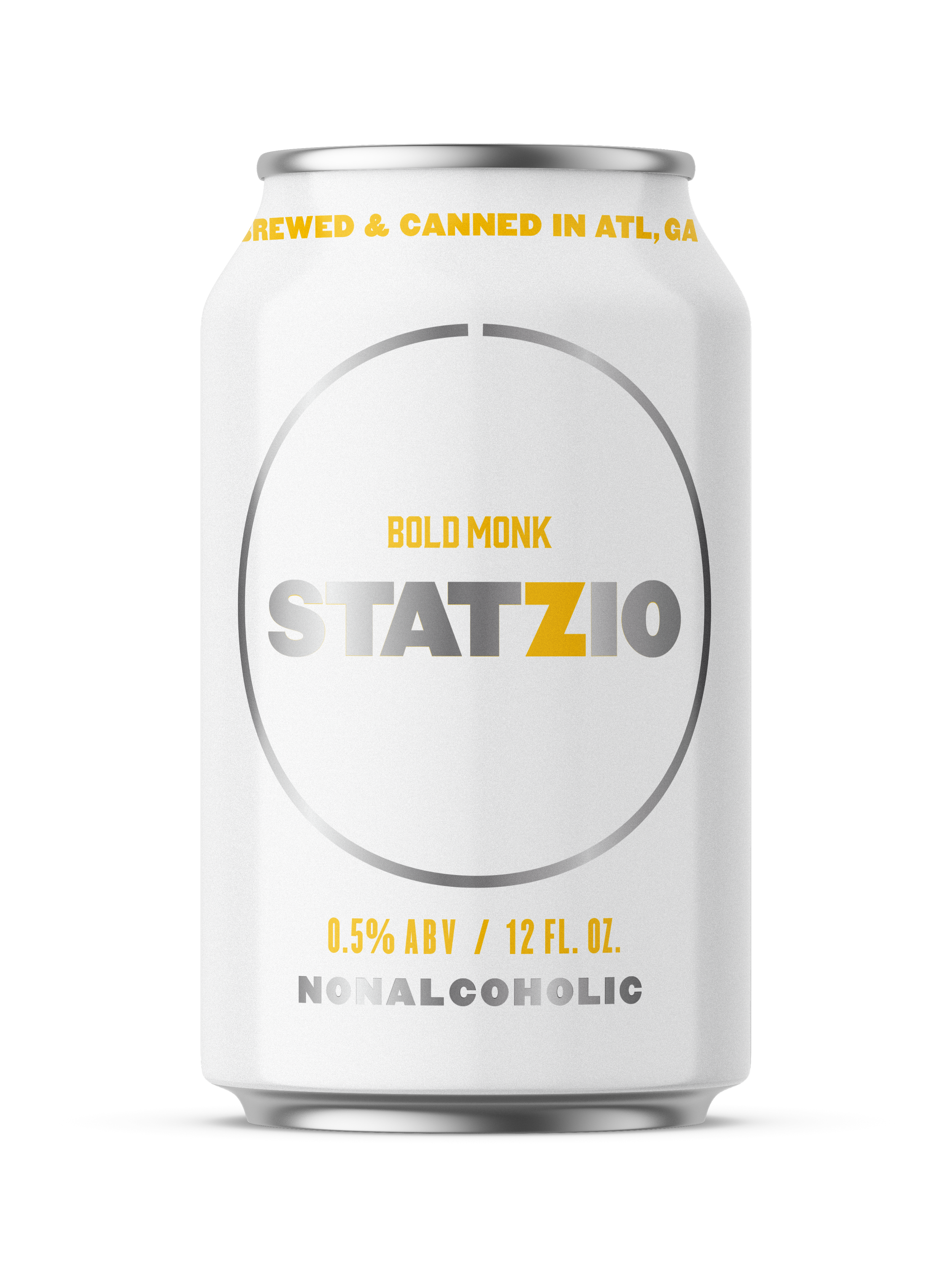
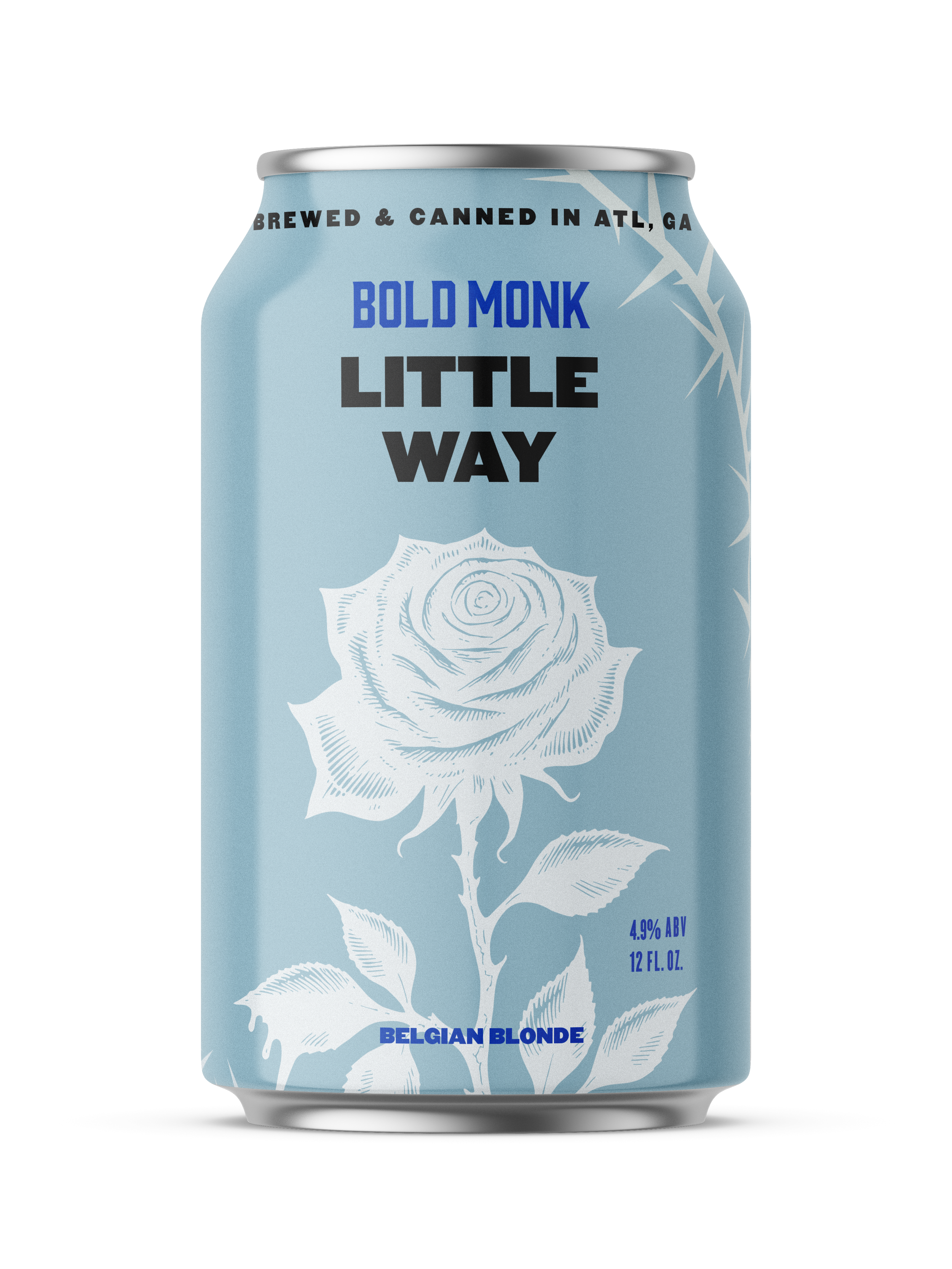
The ideation took Bold Monk's faith-rooted identity and gave each beer its own concept, logo, and color scheme — drawing names and imagery from monastic and liturgical practice — while keeping the lineup unmistakably one family. Across the range, type, illustration, and palette shift to match both the beer and the spiritual idea behind it: restrained black-and-white for a mindful nonalcoholic brew, weighty blackletter and devotional text for a darker collab, deep liturgical reds and golds for an amber Märzen. A shared structural grid — the Bold Monk header, a monastic icon, the beer name, and "Brewed & Canned in ATL, GA" — ties every can together, so each design stands on its own while reading as part of one devotional system.